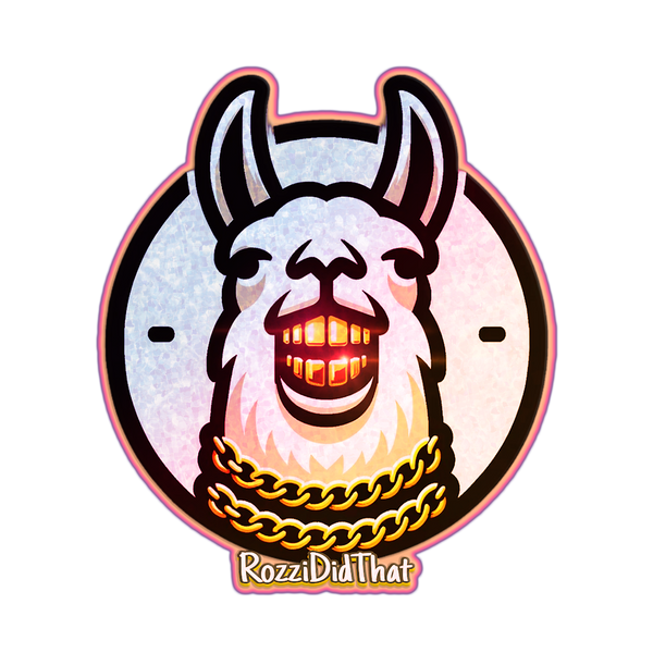
Let’s dive deeper into how to craft a logo that truly speaks to your brand, using the RozziDidThat logo as an example. Creating a logo isn’t just about slapping together cool graphics—it’s about making something that tells your story and leaves a lasting impression. Here’s a behind-the-scenes breakdown of the process:
1. Start with Your Brand’s Essence
Before you even touch a design program, get clear on what your brand stands for. Ask yourself:
- What’s your brand's vibe? Are you bold, laid-back, rebellious, or sophisticated? Your logo should reflect that.
- What’s your mission? If you’re all about creativity and breaking molds (like RozziDidThat), your logo should express that energy.
- Who’s your audience? Think about who you’re trying to connect with. Is it young, trend-setting creatives, or a more corporate crowd?
For RozziDidThat, the logo needed to embody creativity, hustle, and boldness. That’s why we went with something playful and unconventional like a llama dripped out in gold chains, perfectly capturing that mix of ambition and originality.
2. Choosing Your Icon
Your logo’s icon is the face of your brand. It should be unique, relatable, and memorable. A good logo icon:
- Speaks to your brand’s identity: For RozziDidThat, the llama isn’t just quirky; it represents resilience and ambition, showing that the brand stands strong in its creative journey.
- Stands out: Avoid overly complex or generic icons. If you’re a tech brand, you don’t need another “gear” symbol, and if you’re into fashion, you don’t need a basic hanger. Be different.
- Simplicity: Think about how it’ll look in different sizes. Is it recognizable when it’s small or big? Can it be printed or embroidered easily? Simplicity keeps logos versatile.
3. Color Psychology: Get in Their Heads
Colors aren’t just aesthetic—they affect how people feel and think about your brand. Here’s how you can use color psychology effectively:
- Vibrant Colors: These are associated with energy, creativity, and innovation. For RozziDidThat, the bold, almost psychedelic colors send a message of wild creativity, with no boundaries. It attracts the eyes and speaks to those who love to think outside the box.
- Gold: Gold naturally communicates wealth, luxury, and success. It’s a color that represents abundance. Incorporating gold chains and grills into the llama’s design represents both material and spiritual wealth.
- Contrasts and Accents: Use contrasting colors to draw attention to important elements (like the gold chains or the fiery grill). This makes the logo pop and easier to remember.
Tip: Keep your palette focused on 2-3 main colors for a clean and impactful look.
4. Font Selection: Your Brand’s Voice
Fonts communicate more than words—they set the tone. Think about what your font says:
- Bold fonts: Show confidence and power. They demand attention and tell your audience you’re here to make a statement. That’s why the RozziDidThat font is strong and futuristic.
- Playful fonts: If your brand is more fun and relaxed, go with something a little more rounded and casual, like handwritten or bubble-style fonts.
- Make sure it’s readable: Your logo might end up on small merchandise or on mobile screens, so make sure your font looks clear in every size.
5. Experiment and Refine
When creating a logo, you usually won’t land on the final design right away. It’s a process of trial and error:
- Sketch out ideas: Don’t rush to the computer. Start with rough sketches, even if you’re not a great artist. Focus on the concept first, not the execution.
- Get feedback: Show your design to a few trusted people. Ask them what emotions or thoughts the logo triggers. If your feedback group doesn’t “get” your logo’s message, go back and tweak it until they do.
- Think long-term: Your logo should be able to evolve with your brand. Avoid trends that might die off quickly and think about how the logo will age as your brand grows.
In Summary: Crafting a logo is about combining your brand’s message, personality, and style into one simple, eye-catching design. It’s not just about looking cool; it’s about creating something that people will instantly associate with who you are and what you stand for. Whether it’s through the choice of colors, the boldness of your icon, or the font you use, every part of the logo should speak to your unique story.
At RozziDidThat, we used a mix of creative flair and street hustle to build a logo that’s not only memorable but meaningful. And that’s the key to making a logo that stands the test of time.